20100222
Threadless Competition
I'm going to enter a competition I came across on the website Threadless. It can be submitted in the form of a T-Shirt Design or a piece of artwork. It gets voted on by members of the site, and there's a prize of $2000 and other bonuses. I want to do it to try and get noticed by a firm or something. Not very likely but its good to get work out there.
Book of Ideas
I have started compiling a little notebook with literally any idea/technique etc I come across, that I think could one-day be useful in my career. I aim to have (after a few years) a sort of personal mini graphic design bible. One quick examlpe could be:
8) Alex ross book - If you want to emphasise the idea/concept of somebody flying through the air, tilt the skyline behind.
20100214
Something I might try
Print a normal instruction saying look left, but put the arrow facing right. Show to friends, tell them to do what they see. Could be an interesting way of gauging if image is stronger in the form of an object, or writing, and probably just interesting to see how people react. Hopefully they'll respond to the instruction before they realise the arrow and text contradict each other.
20100209
Tuesday 9th February
For my Wednesday project (CHI) , I was planning on looking at TV adverts, but more importantly those that elaborate. By this I mean for example, the Bravia adverts i.e. the bunny rabbits or the bouncy ball, paint explosions in glasgow etc.
The question I came up with originally was "Are more elbaorate TV adverts more effective both aesthetically and in terms of fitting a purpose"
I could then split this down the middle, fitting purpose can be looked at in terms of profit made for the client. The other side of the investigation could look at possibly how the group react and rate the adverts if shown on a projector.
Below is a scanned in copy of my notes, but after my meeting with Sam, we came to the conclusion I should look at Car adverts specifically, and that way I can look at the semiotics etc, and if all cars are literally just cars, how can they be given such totally different images etc.
20100204
Thursday 5th February
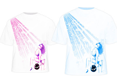
I'm also excited at the idea of this business plan, as I'm currently in the process of getting a range of different T-Shirt designs made with a friend. I could use this opportunity to really have a good go at getting an actually line going, and potentially start making.
Here is an example of our first design, however it is unfinished, the bomb will probably be
removed as it is too strong and of no relevance or meaning.

20100203
Having looked through the Alex Ross book mentioned earlier, I was suprised to find that although his illustrations are mindblowing, in the whole book there is literally only one or two examples of text being used. (I.e "bang"). I will still use this as a style influence, and it has been pointed out to me by Ollie that the onomatopoeia doesn't necessarily have to be in the form of text, and maybe I should look at it in the form of shapes. For example "smack" could be illustrated through the use of various lines and curves.
Subscribe to:
Posts (Atom)